
Your worst-performing site might be your busiest

One site has five times as much rework as another. Before you send in the improvement team, look at what sits beneath the ranking.
Northgate is at the top of the wrong league table.
Sixty jobs needed rework last quarter. More than any other depot. At Brookside, just twelve did.
If you were deciding where to investigate first, where would you go?
Now add one piece of information. Northgate completed 12,000 jobs. Brookside completed 500.
Northgate’s rework rate is five jobs per thousand. Brookside’s is twenty-four.
Nothing on the ground has changed. Nobody has fixed a process or retrained a team. Yet the apparent performance story has turned upside down.
These are fictional depots, but the management dilemma is real: a league table can rank how much work people do while appearing to rank how well they do it.
And there is another twist coming. Even the rate does not tell the whole story.
First, change the view
Imagine six service depots carrying out repairs. We count each completed job that required corrective rework once, using the same checks, definitions and quarterly period at every location.
| Depot | Jobs requiring rework | Completed jobs | Rework jobs per 1,000 completed jobs |
|---|---|---|---|
| Northgate | 60 | 12,000 | 5 |
| Riverside | 40 | 4,000 | 10 |
| Westfield | 36 | 6,000 | 6 |
| Eastbank | 24 | 3,000 | 8 |
| Hilltop | 18 | 1,000 | 18 |
| Brookside | 12 | 500 | 24 |
Illustrative data, not actual company results. Each rework job belongs to the completed-job total beside it. The example assumes consistent identification and recording of rework.
Sort by the count and Northgate stands out. Sort by the rate and Brookside does. Northgate moves from the highest count to the lowest rate.
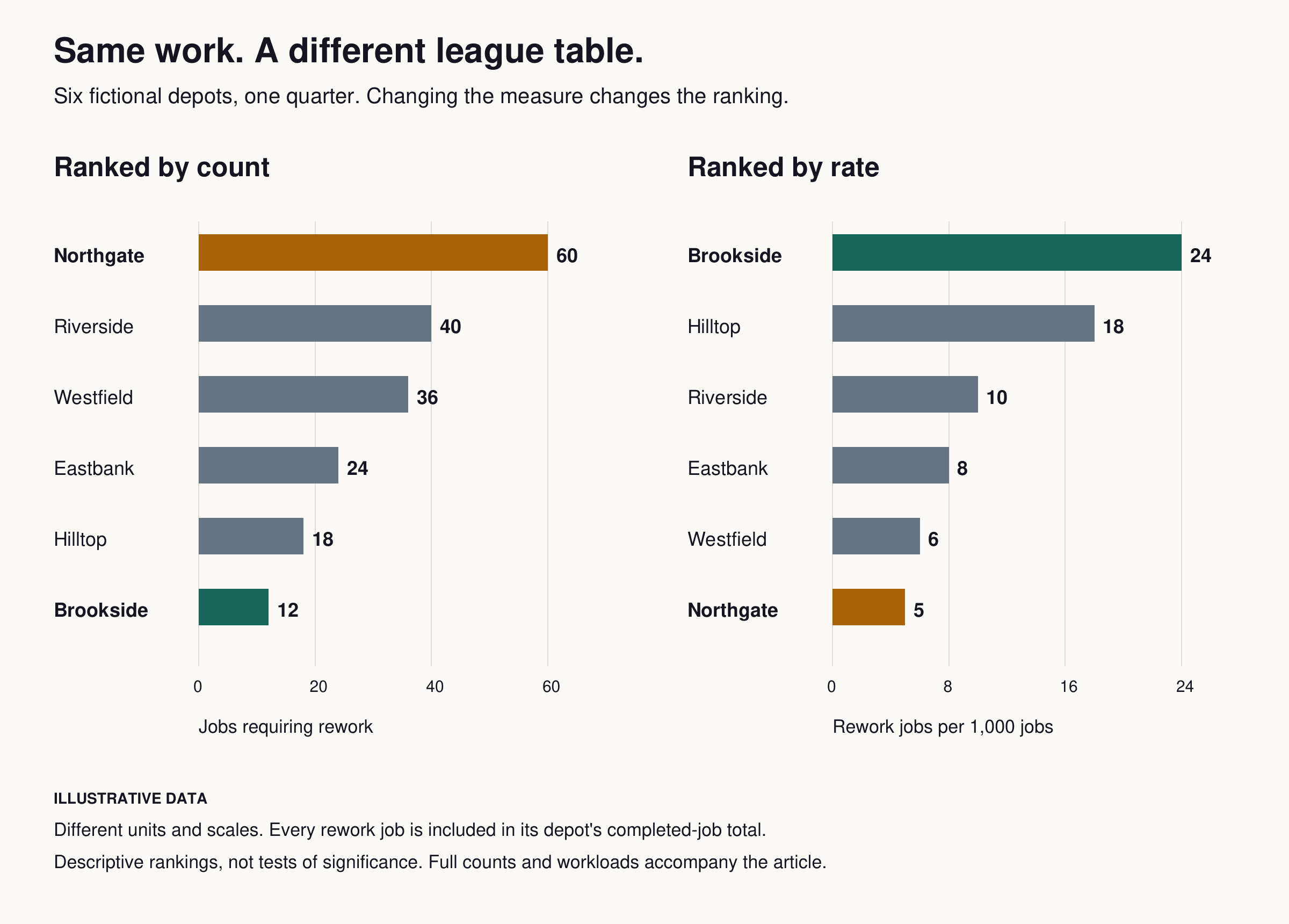
The same six depots, the same quarter, two different measures. The panels use different units and scales. These are descriptive rankings, not tests of a performance difference.
That is the first useful job of visualisation: making a missing comparison difficult to ignore.
The principle is well established. The US Bureau of Labor Statistics uses hours worked when calculating workplace injury and illness incidence rates, and recommends comparisons with operations doing similar work and employing workforces of similar size. BLS, computing incidence rates.
The appropriate denominator depends on the question. A delivery problem might be considered against deliveries; a defect measure against units inspected. The people, activities and time period counted underneath must match the events counted on top.
Dividing by a convenient number does not automatically create a fair comparison.
The second twist: some sites get different work
Northgate now looks reassuring. Its overall rate is lower than Westfield’s: five rework jobs per thousand against six.
But Northgate handles mainly routine repairs. Westfield takes a larger share of complex ones.
Break their figures down and the picture changes again:
| Type of repair | Northgate | Westfield |
|---|---|---|
| Routine | 18 rework jobs / 9,000 jobs = 2 per 1,000 | 3 / 3,000 = 1 per 1,000 |
| Complex | 42 rework jobs / 3,000 jobs = 14 per 1,000 | 33 / 3,000 = 11 per 1,000 |
| All repairs | 60 / 12,000 = 5 per 1,000 | 36 / 6,000 = 6 per 1,000 |
Westfield has the lower observed rework rate in both categories. Yet its overall rate is higher, because complex repairs make up half its workload, compared with a quarter at Northgate.
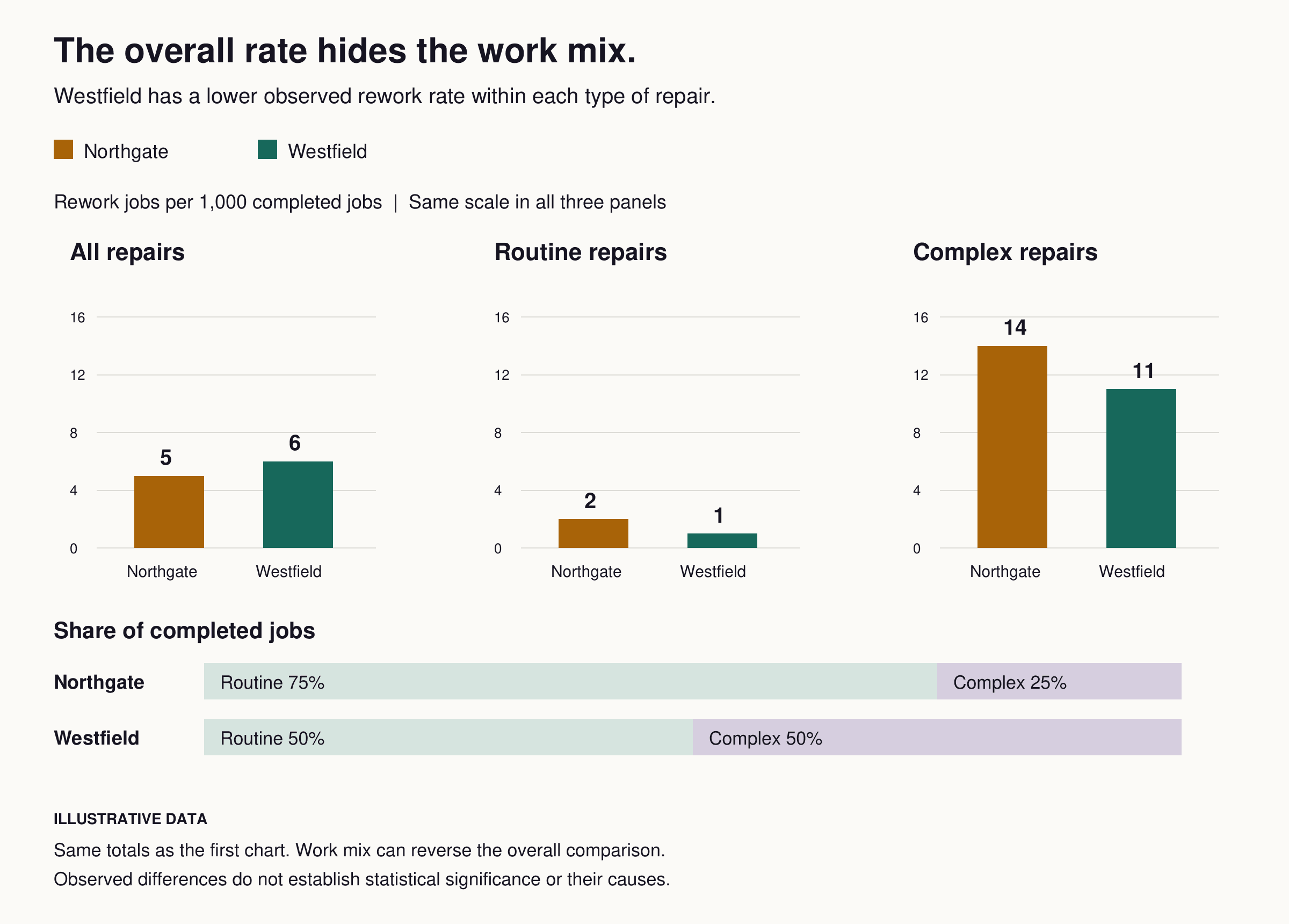
Illustrative breakdown of the same Northgate and Westfield totals. Observed differences alone do not establish statistical significance or explain their causes.
The aggregate combines two things: the results within each type of work and how much of each type a depot handles.
Healthcare measurement faces a comparable problem. The Agency for Healthcare Research and Quality explains why outcome comparisons may need to account for differences in patients’ underlying risks, so providers are not penalised simply for treating sicker populations. That clinical example illustrates the comparison principle; it does not supply a ready-made adjustment model for a repair business. AHRQ, adjusting quality scores.
For our depots, showing the repair categories already gives the meeting something concrete to investigate. What does Westfield do differently on complex repairs? Are those repairs genuinely comparable? Is the classification consistent?
Do not rush to invent a complexity score that produces a more comfortable ranking. Choose relevant comparison groups before looking for winners. And be careful about adjusting away the very problems you need to fix, such as poor planning or unreliable equipment.
A small site can jump a long way
Brookside has another feature worth seeing: its denominator is small.
At 500 completed jobs, one additional job requiring rework would move its rate by two per thousand. At Northgate’s 12,000 jobs, one would move the rate by about 0.08 per thousand.
A few events can therefore move a small depot much further up or down a table. The position looks precise even when the evidence behind it is limited.
Public health statistical guidance highlights the importance of showing uncertainty when numbers are small. It also distinguishes uncertainty from random variation from systematic errors that confidence intervals cannot fix. DHSC, confidence intervals.
Keep the underlying counts visible. Where you are making claims about sustained performance, use suitable uncertainty measures and examine the pattern over time. Simply being first or last does not establish an unusual result.
That is also why the two charts here are demonstrations of arithmetic, not evidence that one fictional manager is better than another.
Keep the count. It answers a different question
There is a temptation, once the rate has been revealed, to throw the original count away.
But Northgate still had sixty jobs requiring rework. Those jobs used time and resources. A low rate does not erase their consequences.
At Northgate’s current volume, reducing comparable rework by one job per thousand would mean twelve fewer jobs requiring rework. Brookside would need a reduction of twenty-four per thousand to remove twelve, which would eliminate all its recorded rework in this example. These calculations illustrate scale; they do not tell us what either site could realistically achieve.
So the highest-rate location is not automatically where an improvement will produce the largest total benefit. Nor is the largest location automatically the priority: severity, cost, preventability and the resources required all matter.
Rates help you compare frequency. Counts help you understand scale. You need both to decide what to do.
Give every view a decision to support
A useful dashboard lets you move between questions without pretending they are interchangeable:
- Where is the volume of rework? Show counts alongside workload to understand the scale of the problem.
- Where does it occur more often? Show rates with matching denominators and visible underlying numbers.
- Are we comparing similar work? Break the results down by relevant job type, operating conditions or customer group.
- Is the difference persistent or unusual? Look over time and use appropriate statistical methods, rather than a single period’s position.
- Where could action make the most difference? Bring in the consequences, likely causes and realistic scope for improvement.
NHS England’s board guidance recommends statistical process control for understanding variation over time, and funnel plots and distribution charts for comparisons between systems. It also points to learning from appropriate peers. These techniques support investigation; a chart cannot diagnose a cause by itself. NHS England, the insightful ICB board.
Even a clear comparison needs a check on how the data was produced. More intensive inspection can identify more defects. Different definitions can make similar events look different. A rate cannot repair those inconsistencies.
Before you send in the improvement team
Return to Northgate. First it had the most rework. Then it had the lowest overall rate. Then Westfield showed lower rates within each repair category.
The data did not change. The questions became more useful.
Northgate may still deserve attention because of the volume involved. Brookside’s high rate deserves examination, with its smaller numbers in view. Westfield may offer something worth learning about complex work. None of those conclusions was available from the original ranking alone.
Before your next performance review, pick the location at the top of the wrong table. Put its workload, work mix and history beside its result.
Would you still send the same people, to the same place, to fix the same thing?
Make every report count.
Tell us what your team reports and we will show you how it works in Logincident.
Contact us